
Revamping Wylth’s Dashboard
Leading to Enhanced Client Management and Increased Acquisition by 900%
Revamping Wylth’s Dashboard
Enhanced Client Management and Increased Acquisition by 900%
Revamping Wylth’s Dashboard
Leading to Enhanced Client Management and Increased Acquisition by 900%


Project Overview
Company
Wylth - B2B Fintech Startup
Industry
Wealth Management, SAAS
Timeline
July 2023 - August 2024
Status
Shipped & LIVE
Team
2 Designers, 1 Design Manager,
1 BA, 1 QA and 3 Developers
My Role
Worked closely with stakeholders, research, UX design, development hand-off, complete end-to-end project delivery.

Buisness Impact of Redesign
🎉 The number of financial advisors on Wylth grew by 900%, driven in part by the improved experience by redesigned dashboard.
🤩 MF transactions processed on Wylth rose by [X]% showing increased platform adoption and user trust.
View Project in Slides
What is Wylth?

Wylth® is a Wealth-Tech Platform as a Service (PaaS) designed for financial advisors (IFAs an RIAs).
Its a B2B2C Platform helping advisors manage their client's finances.
It covers the entire customer lifecycle including onboarding, transaction management, reporting, and portfolio management.
Why did we do this project?
Why did we do this project?

The old dashboard had been functional but far from optimal—it struggled to meet the daily needs of Independent Financial Advisors (IFAs), leading to reduced engagement.
With the main focus was on increasing adoption/retention we also focused on solving immediate issues, while ensuring the foundation was scalable for future needs.
Challenges faced by Users & Business
User Challenge
Lack of Key features and that certain data points displayed incorrect values reduced trust in the system.
Features that were present were located deep inside and repeating it reduced their efficiency.
Business Challenge
IFAs were hesitant to switch to Wylth and subscribe due to missing key features.
This created a barrier to adoption, impacting user retention and growth.
Research Process

We studied competing platforms - IFA Now, Redvision, Fund expert & Fintso, to understand mental models of users and the best practices.
We also spoke directly with Independent Financial Advisors (IFAs) to understand their daily work life, feature requirements and rants - and how a feature of another platform is so good and ours is not.
With Customer Support Team Insights we analysed recurring complaints to pinpoint areas of friction & opportunities for IFA’s.
To start with we did our research, for which we did competitive benchmarking, spoke to IFA's and gathered insights from customer support team.

Figure : Competitive Benchmarking
Mental Model of IFA’s
Excellent at Handling Complex Data
Including large datasets like tables with multiple rows & coloumns
Visualising through graphs, charts & data table
Helping IFA's visualise trends and growth over time
Quick Access to Key Actions
Like doing transactions and quickly onboarding clients
Macroscopic View for overall analysis
For overall analysis of trends and data
Microscopic View for going deeper
For granual level detail like going to each account
Project Story
The old dashboard had been functional but far from optimal—it struggled to meet the daily needs of Independent Financial Advisors (IFAs), leading to reduced engagement.
The challenge lay not just in providing key features & optimising dashboard, but in doing so while taking lead and doing so within tight timelines while juggling multiple ongoing projects as well.
With the main focus was on increasing adoption/retention we also focused on solving immediate issues, while ensuring the foundation was scalable for future needs
Bigger screens, better details.
Check out full project on a desktop!
Problem Analyis of Old Dashboard

Missing Essential Features
Key tasks that could simplify an IFA’s work -
like AUM summary, transaction summary, and SIP summary—were missing.
Complex & Deep Navigation
Essential tasks took longer because key features were hidden in multiple layers of menus
Limited User Engagement
The interface did not give confidence during critical financial actions resulting in fewer transactions and drop off from platform.
Old Dashboard


New Dashboard Features - 4 Key Buckets
For the enhancement of dashboard, we broke down the features into 4 key buckets - with each having one or more function.
Get Insights
Navigation
Quick Action
Calender
Dashboard Widgets that Enables IFA's to Visualise Data better
MF Transaction Summary
It provides a snapshot of mutual fund transactions, including purchases, redemptions, and switches, for quick tracking.
AUM Procured
It tracks assets acquired over time, helping advisors monitor inflows and overall portfolio growth.
Breakdown of Solution
The redesigned dashboard enhances efficiency by providing key insights, streamlining task management, enabling quick actions, and simplifying navigation.
Each solution built on the dashboard falls into a specific category, so we grouped them accordingly for better organization.
Solutions Expanded - 4 Features

Getting Insights

AUM Growth Widget to track trends, analyse data, and gain insights
1.1 How might we make it easier for advisors to analyse AUM,SIP and Transaction Data effeciently?
Existing Process to track AUM Data
Detailed breakdowns in a table format with Tabular AUM Report
AUM distribution representation with Donut Chart Visualization


Figure : - Old Ways for IFA's to get AUM Data- AUM Report & AUM Chart
Issues with Existing Process
The table only provided static snapshot, and also missing key points like inflow & outflow.
The donut chart only showed the current distribution but didn’t tell how AUM changed over time.
The report showed values but didn’t show key trends automatically.
How did we aproch to solve this?
We decided to use data visualisation with additional metrix like inflow and outflow on the dashboard widgit- giving advisors the best of both worlds - structured data in table when needed and charts with view for quick insights and trends.
Solution Exploration
We experimented with 3 visualization types - all making sure shows trends over time and includes AUM Inflow and outflow graph, area chart & stacked bar graph
AUM Growth
Show inflow/outflow only
Option 3- Area Graph
Opening
AUM
AUM Inflow
Existing Clients
AUM Inflow
New Clients
Market
Growth / Loss
AUM
Outflows
20 L
-20 L
40 L
60 L
80 L
100 L
Jan 23
Feb 23
Mar 23
Apr 23
May 23
Jun 23
Jul 23
Aug 23
Sep 23
Oct 23
Nov 23
Dec 23
Option 1 - Bar Graph
Opening
AUM
AUM Inflow
Existing Clients
AUM Inflow
New Clients
Market
Growth / Loss
AUM
Outflows
Jan 23
Feb 23
Mar 23
Apr 23
May 23
Jun 23
Jul 23
Aug 23
Sep 23
Oct 23
Nov 23
Dec 23
-20 L
20 L
40 L
60 L
80 L
100 L
AUM Growth
Show inflow/outflow only
Option 2- Stacked Bar Graph
AUM Growth
Show inflow/outflow only
Jan 23
Feb 23
Mar 23
Apr 23
May 23
Jun 23
Jul 23
Aug 23
Sep 23
Oct 23
Nov 23
Dec 23
Opening
AUM
AUM Inflow
Existing Clients
AUM Inflow
New Clients
Market
Growth / Loss
AUM
Outflows
20 L
-20 L
40 L
60 L
80 L
100 L
We chose STACKED BAR GRAPH because it showed multiple data in a go,
made it easy to spot trends, will work well with 12 months of data,
and were preferred by advisors during testing.
We then created the TABULR VIEW for the Widget - data table states WHILE HOVERING on the stacked bars, as well as the only inflow/outflow widget.
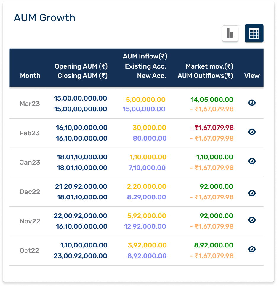
Tabular data View

New Design
Visualise data related to AUM to help financial advisors track performance, trends, and growth over time.
The user can switch between visual data & tabular data to view the trends or get the exact numbers. The users can toggle between inflow-only, outflow-only, or combined views.
Figure : AUM Growth Widget - Graph & Chart View & Hover State
1.2 How might we enable advisors to get summary of Transactions happening?
Existing Process to Track Transaction
To get any information related to transaction, IFA's relied on transaction report in a table format from Transaction Report coming from RTA


Figure : Existing way of analysing transaction details
Issues with Existing Process
Reliance on transaction report for data - time consuming & did not provide trends
The Transaction Report only displayed individual/family-level data, missing a holistic view of transactions.
The Transaction Report only one type of transaction & client could be shown at once.
Competitive Analysis
We analysed platforms to see data points, interaction and key feautures available in the transaction widget


Figure : Ways & Data points of analysing transaction on various platforms
How did we aproch to solve this?
We created widgets from data points of MF Transaction report.
We then segregated data into order & transaction.
While creating tables, we found SWP and Switch had extra data points which would disrupt the table's structure and create inconsistency with other sections.
This would lead to complicating navigation between sections in the expanded views
Problem Solving
We added two sections: ’Scheme Folio’ and 'From Scheme Folio’ in the tables to ensure consistency in the data points across the table so users can easily navigate.
For data points in sections other than SWP and Switch, the From Scheme field will remain empty


Simplifying Navigation

Creating Navigation for IFA’s & RM’s at Multiple Levels
2.1 How might we make it easier for advisors to find and manage Multiple RMs?
Problem
Cumbersome Navigation – Users had to go through multiple steps to find and select the right RM.
Lack of Specific Search – No quick way to search, filter, or sort RMs, making it difficult to locate the right person.
Unclear Multi-Level Structure – The hierarchy was confusing, making it hard for users to understand reporting lines and select the correct RM.-

Figure : Old RM Selection from Dashboard
Solution Process
We understood how RM’s Level Work and that there can be a maximum of 3 levels under an RM
For hierarchy, we used indentation to visually differentiate levels (e.g., RM Level > Name > Main RM/IFA).
Then brainstormed on ways to show this hierarchy - through colours & shape. We did so to make it accessible.
Additionally we created visual hierarchy through levels.
We added a profile picture to identify and introduced interactive states, such as select and deselect.


Recognising that people don't appreciate being categorised or ranked, we chose to use the OPTION 3 shape and colour to show hierarchy instead of L1, L2, and L3
Development Handoff Logic
The drop-down selection logic followed a top-down approach:
Level 1: Selecting Level 1 covers itself and all levels below it (L1, L2, L3).
Level 2: Selecting L2 covers itself and the level beneath it (L2, L3), but not L1.
Level 3: Only L3 gets selected


Figure : New RM Selection from Dashboard
Quick Action

Performing Key tasks quickly
3.1 How might we make it easier for IFAs to find and complete key tasks quickly?
Existing Process
IFAs had to navigate deep into the menu to perform multiple tasks, making the process time-consuming and inefficient.
This led to delays in completing routine actions.
Issues with Existing Process
Some essential tasks, like sending a statement of account to clients, were missing from the platform, adding to user frustration.
IFAs couldn't fully switch to the platform due to the lack of key features.
Solution
Creating widgets on dashboard to enable IFA's to perform task easily


Figure : Key screens of the flow for sending statement of accounts to clients
Key Learning from fast paced startup
Starting Design with Ambiguity: Starting from scratch without the brief not being fully chunked out and figuring out details on the go. Gaining clarity on the way is not bad!
Rapid Prototyping: Early stakeholder involvement (business, tech and QA), Multiple check-ins and Quick iterations minimised blockers and helped me ship on time!
Alternative Metrics for Validation: Tracking transaction volume, user growth, and reduced complains helped us measure success without advanced analytics.
Collaboration: Being continuously in touch with business and tech team led to understand tech limitations & challenges beforehand so we could solve for it early.
Also collaborating before hand has led us to simplify UX in some cases. so why not?